A fresh rebrand for Tokyo Hon Sushi, blending playful visuals and modern charm to reflect its authentic dishes and lively atmosphere.
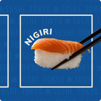
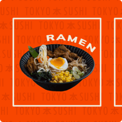
Let’s start by examining the old design and the challenges it presented and areas that can be improved in the rebrand..


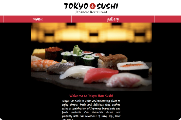
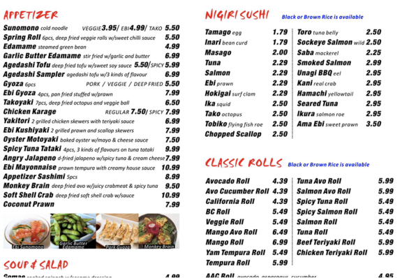
The redesigned introduces a playful mascot, bold typography, and a vibrant color palette. This creates a fun, nostalgic identity that feels approachable, memorable, and uniquely Tokyo Sushi.
These typefaces were chosen for its clean minimal look, while conveying a strong, sophisticated look while remaining approachable and friendly.
The bold blood-orange red and blue compliment it each while showing diversity and the soft off-white and black provide a neutral but nostalgic inviting tone without being too sharp and in your face. This in turn create a lively yet recognizable brand colours.
The project evolved through rounds of testing, where navigation and feature gaps became clear. These insights guided a responsive solution, starting with the mobile design you see here.
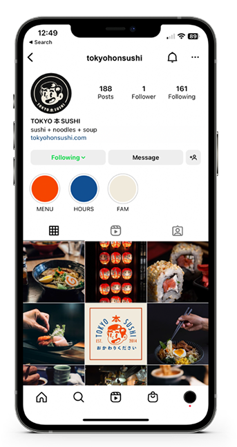
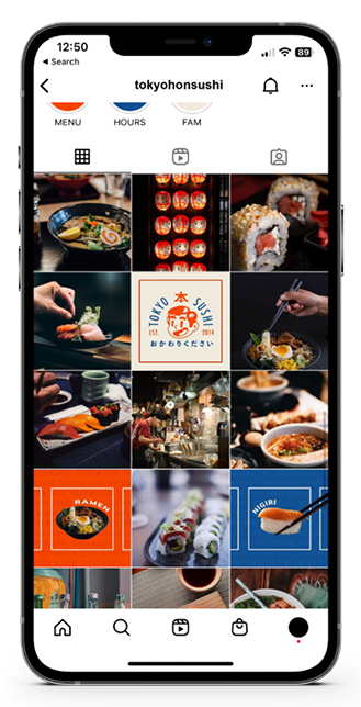
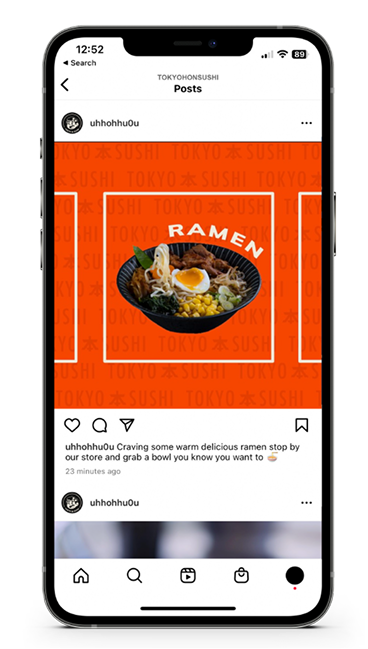


These design solutions address the problems previously mentioned in the beginning of this case study.

