

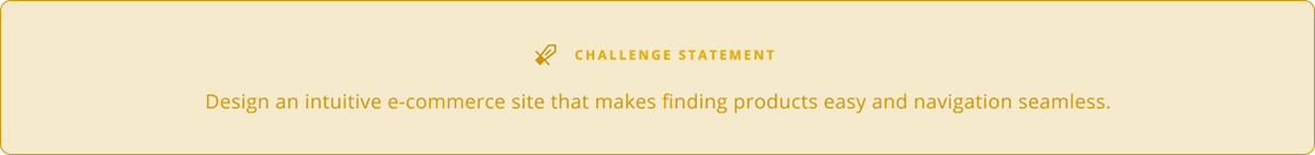
As camping grew in popularity, I set out to create a platform that makes finding and buying gear simple for everyone.


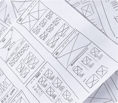
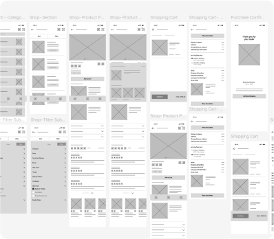
I began with simple iterations to define the core features and visual style, creating a foundation to test ideas before expanding the experience. Here’s how it all came together.
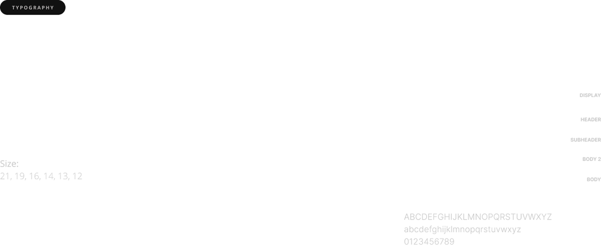
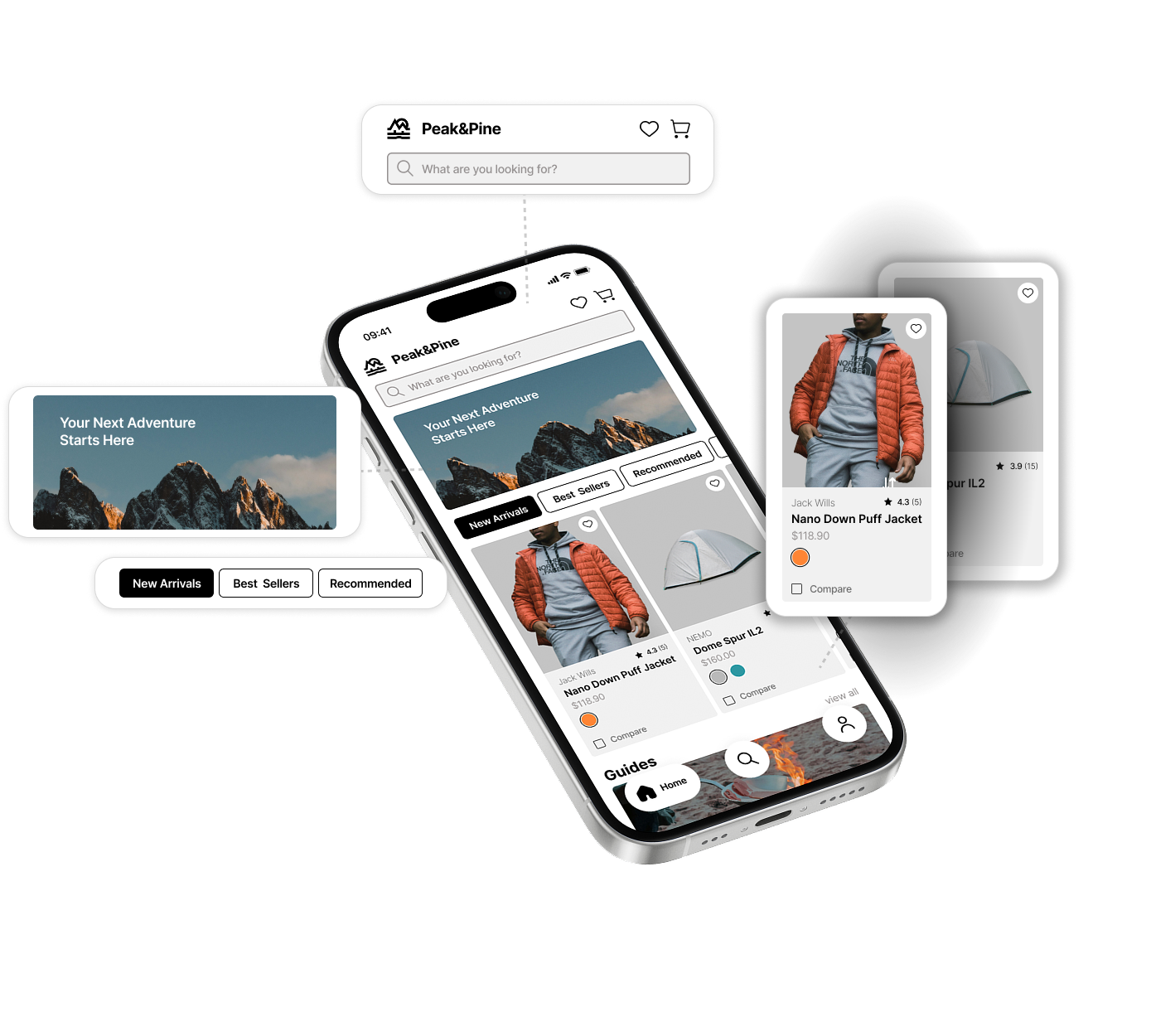
This typeface was chosen for its balance of sharp edges and rounded curves, conveying
a strong, sophisticated look while remaining approachable and friendly.
a strong, sophisticated look while remaining approachable and friendly.
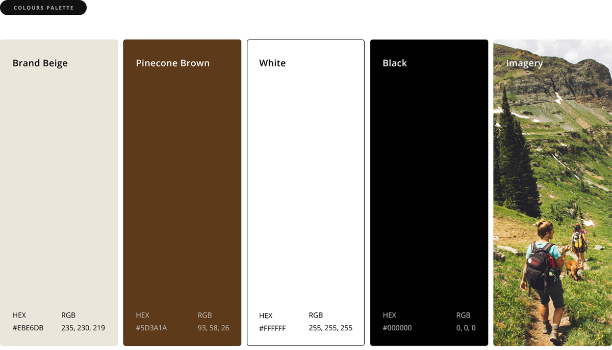
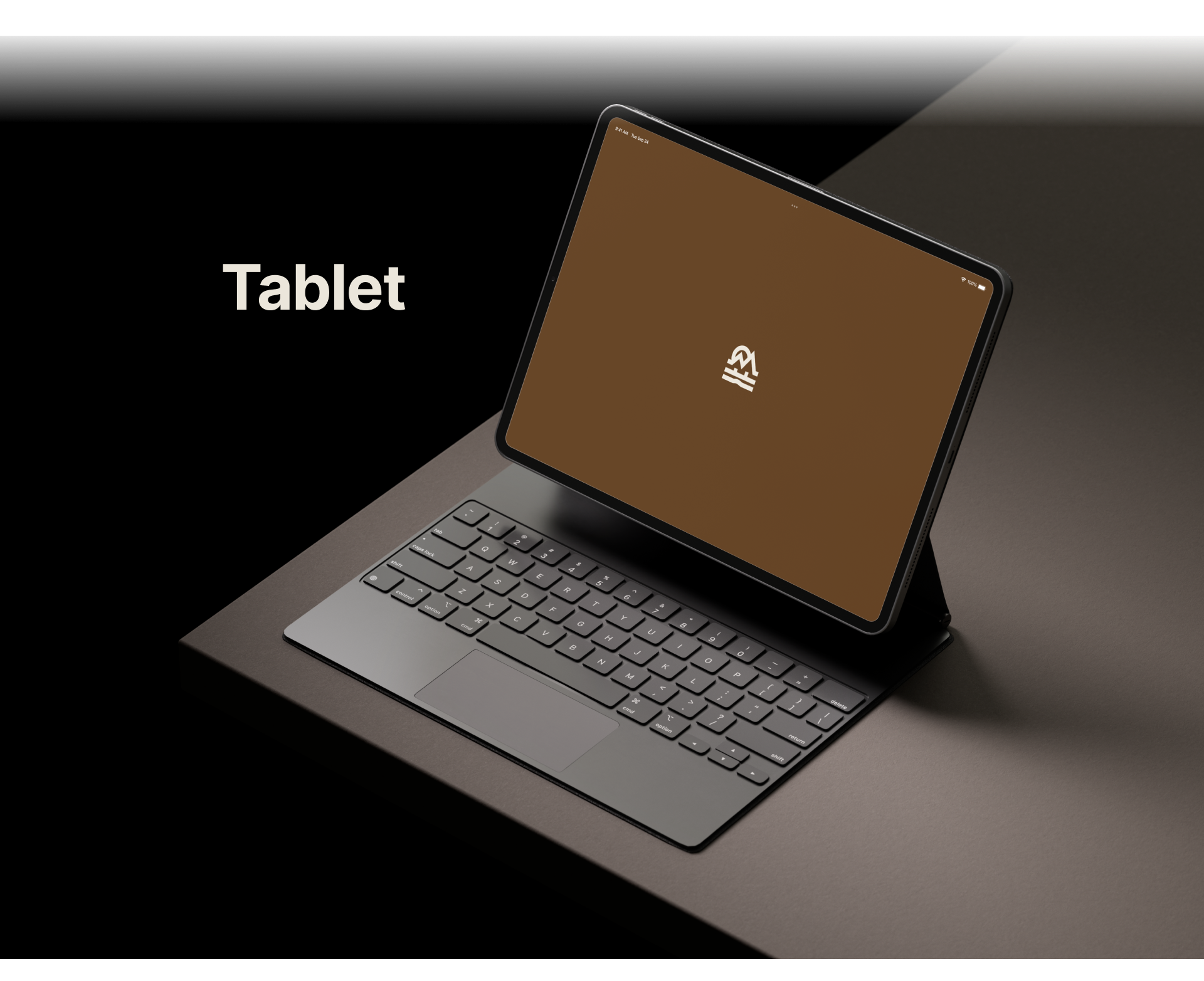
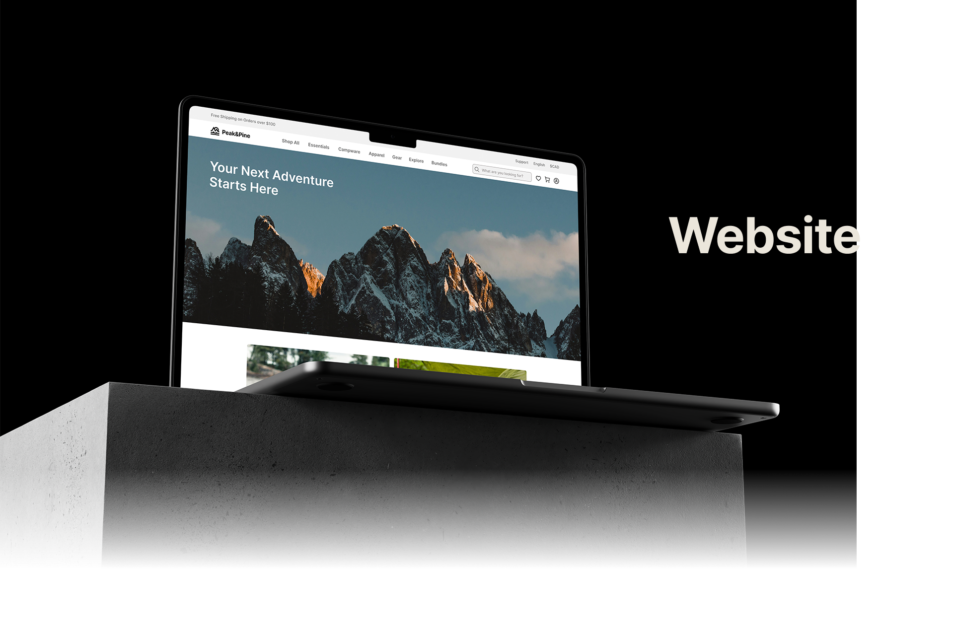
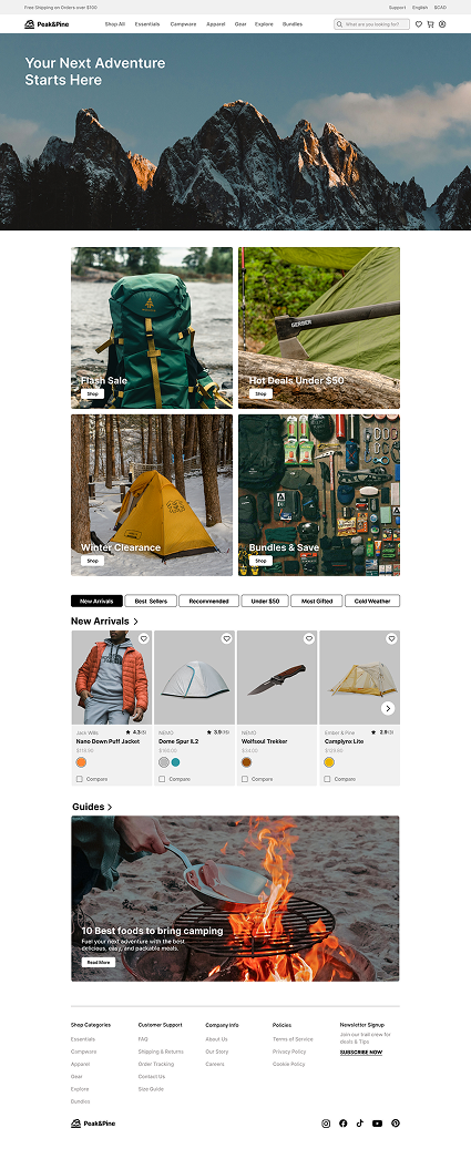
The rich pinecone brown grounds the brand in the outdoors, symbolizing resilience and warmth. A soft beige adds balance and approachability, while black and white are used as supporting colours. Imagery is used to display products and create a vision of the lifestyle.
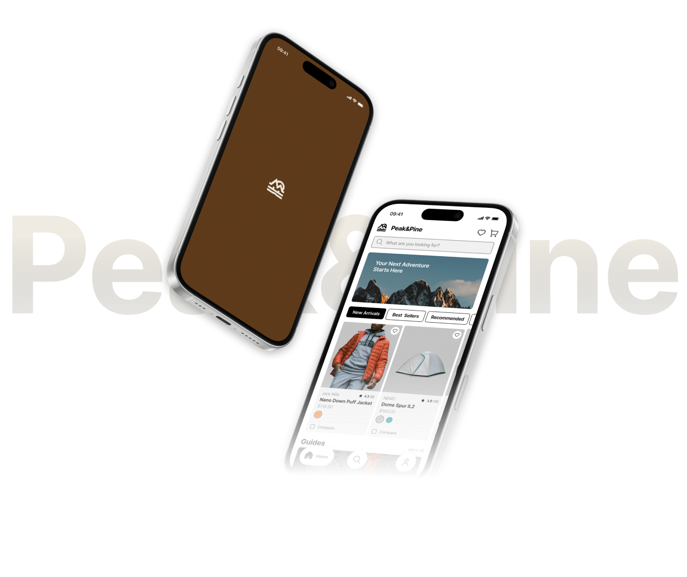


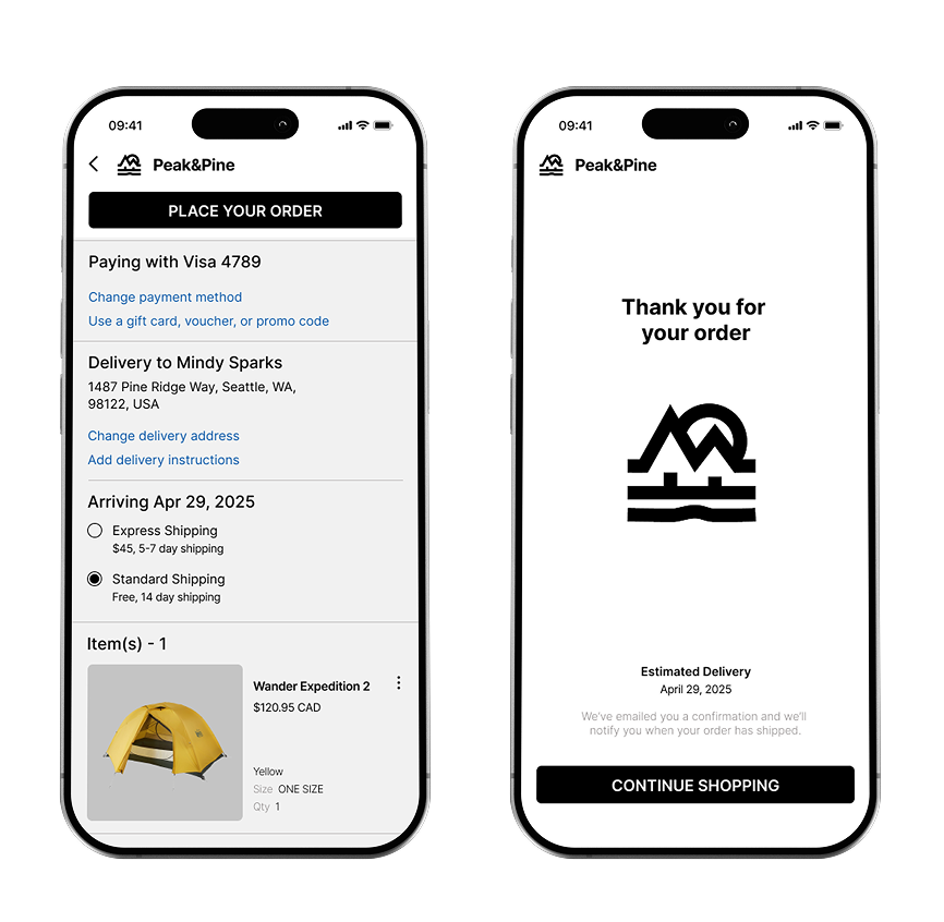
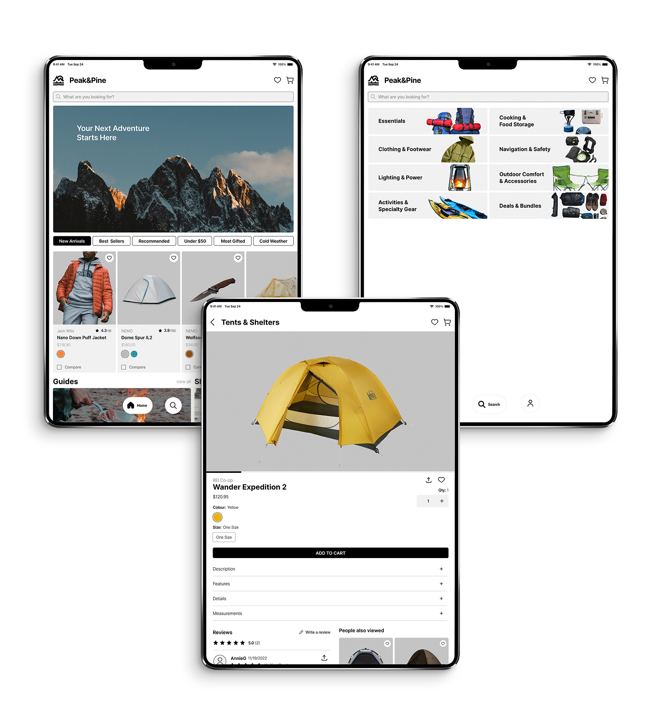
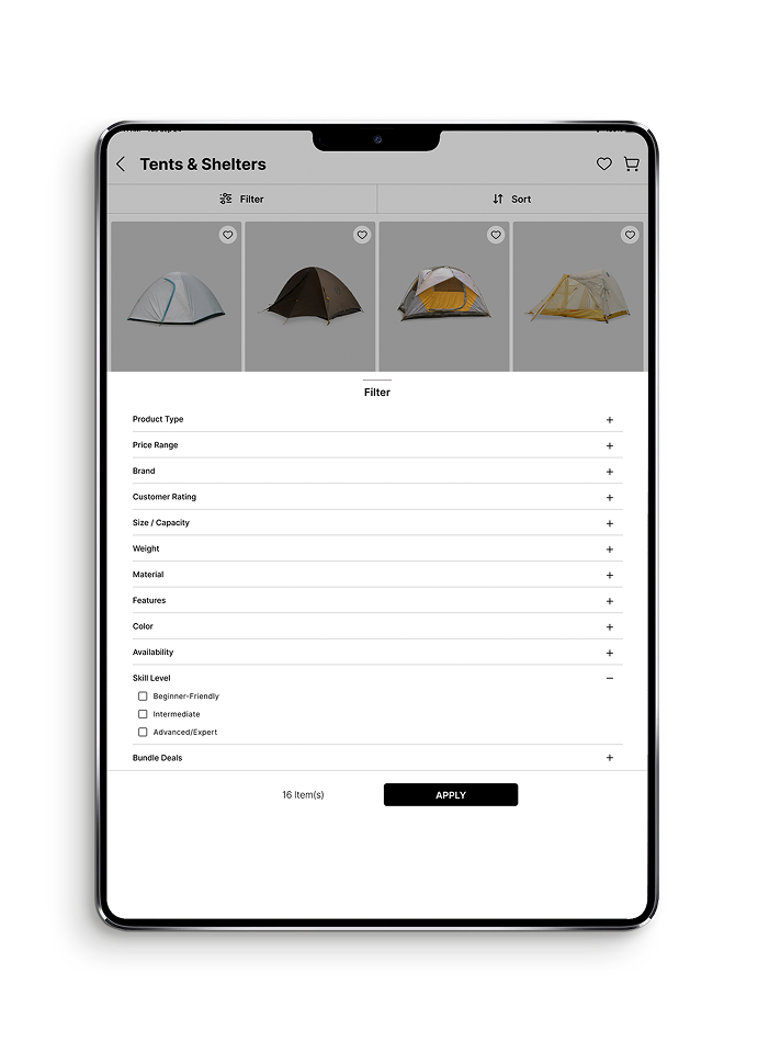
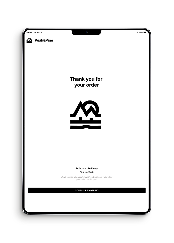
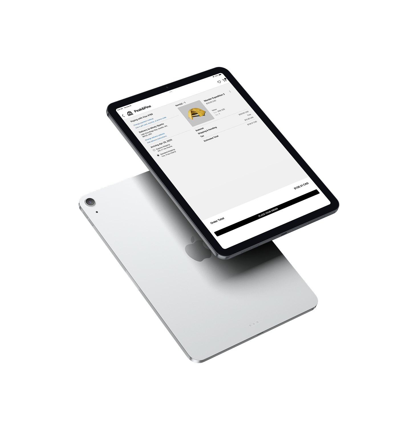
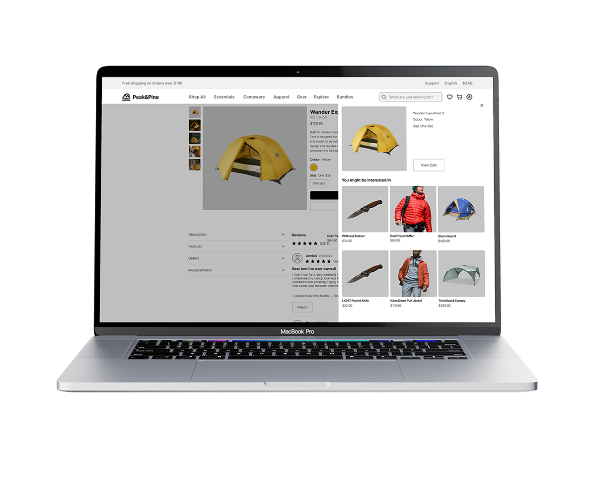
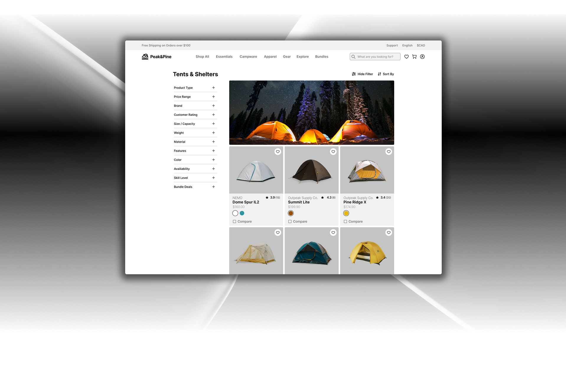
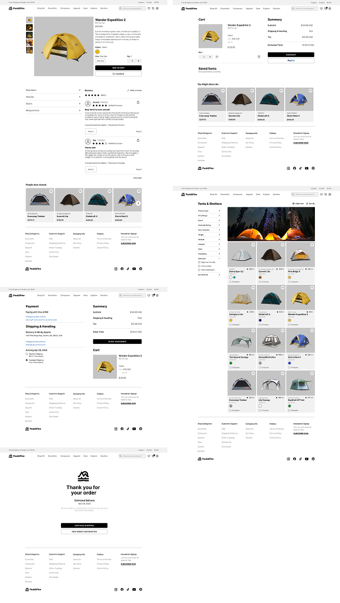
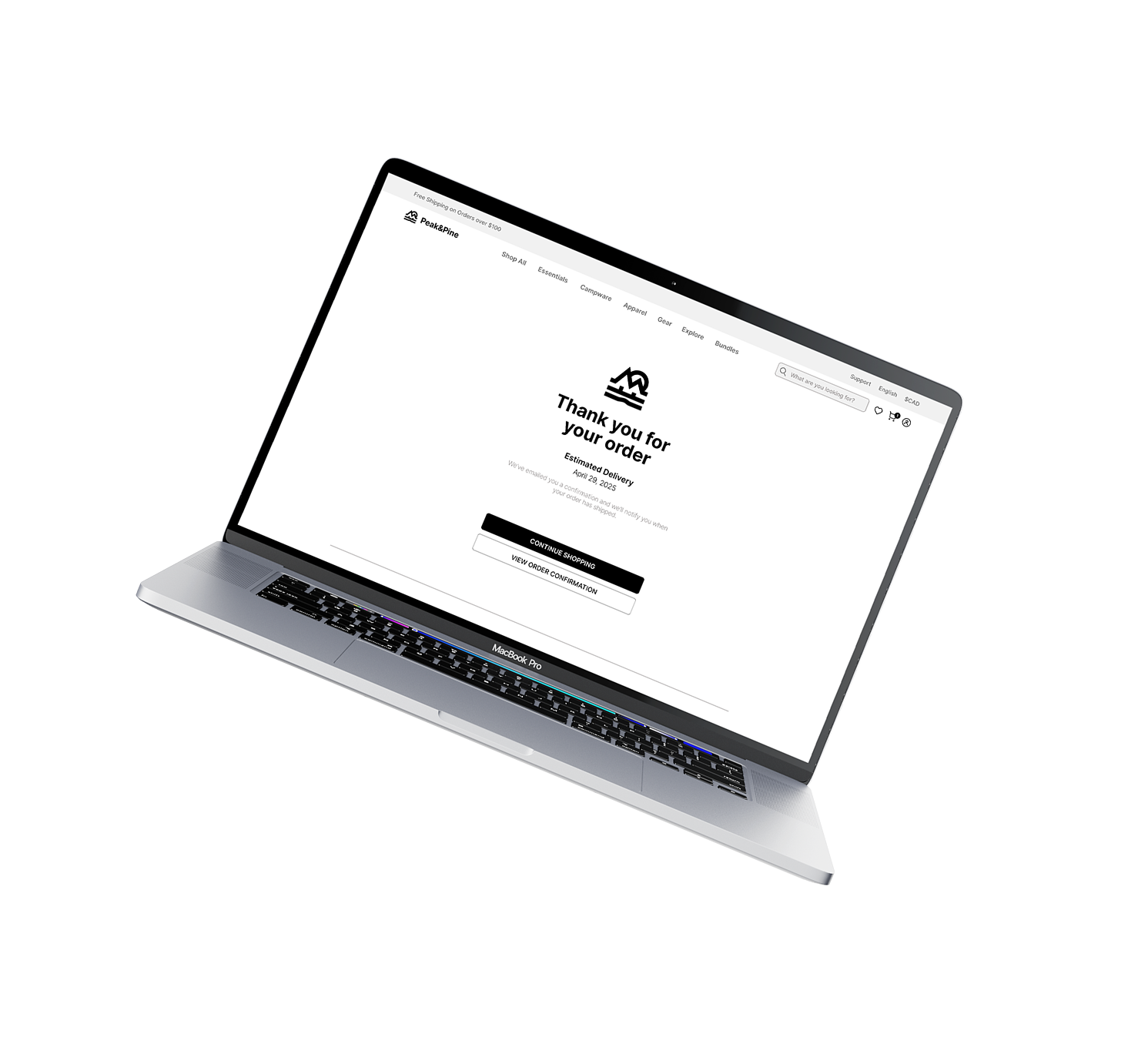
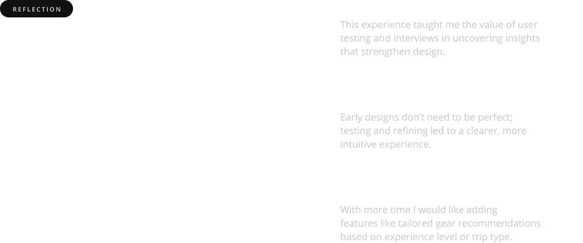
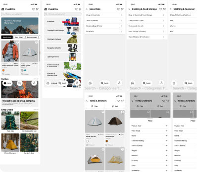
The project evolved through rounds of testing, where navigation and feature gaps became clear. These insights guided a responsive solution, starting with the mobile design you see here.
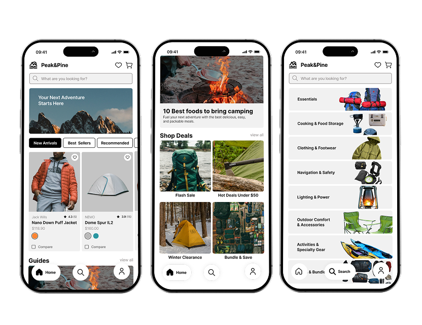


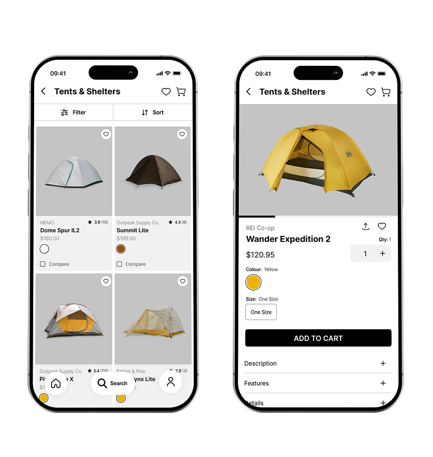
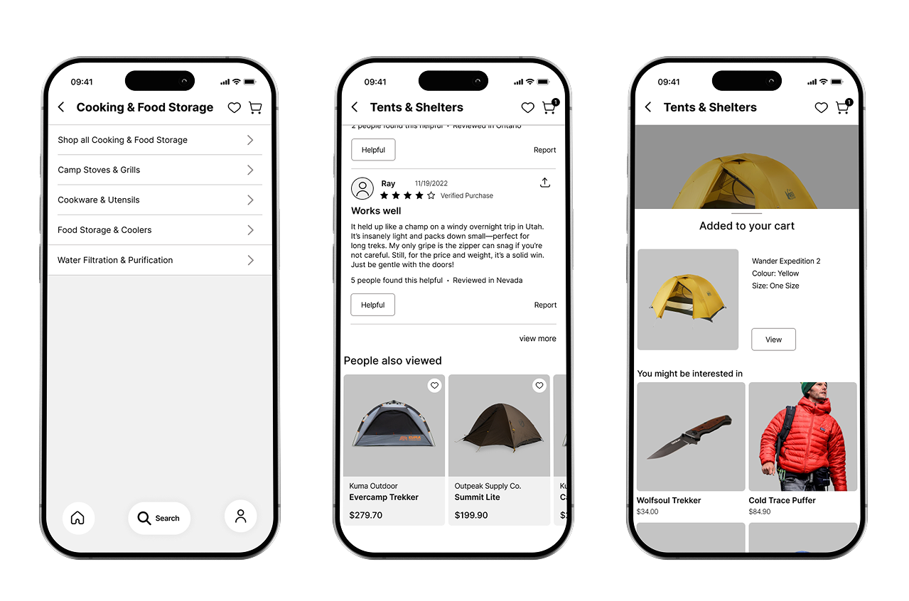


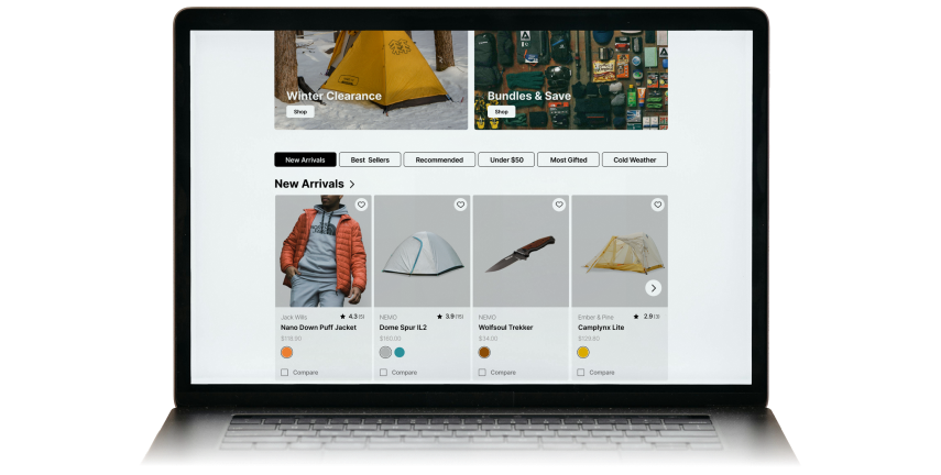
These design solutions address the problems previously mentioned in the beginning of this case study.