


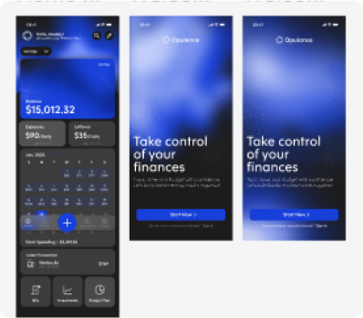
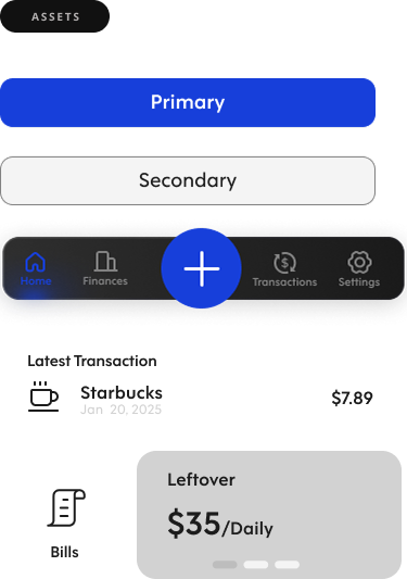
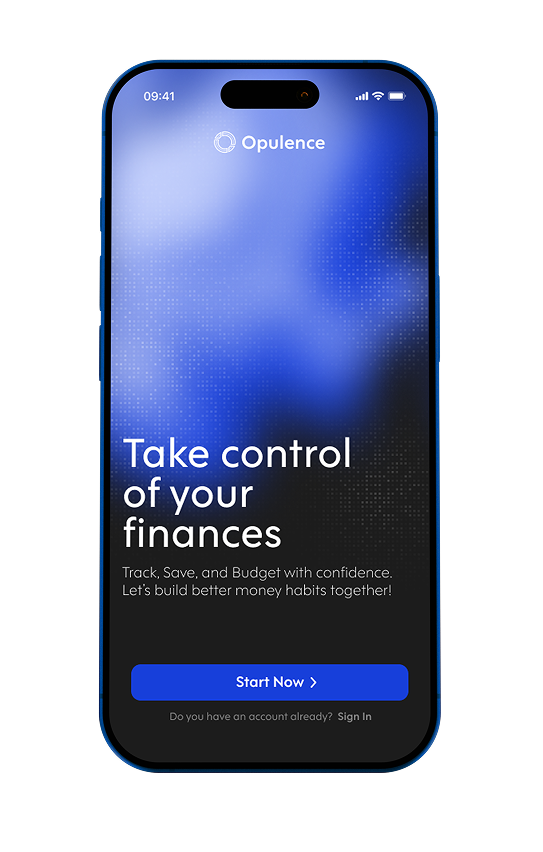
This beginner-friendly app helps you budget smarter, track spending effortlessly, and build healthy saving habits—all while learning to invest with confidence. Everything you need to start growing your money, all in one place.


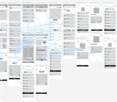
Through rounds of testing and refinement, Opulence grew into a more intuitive, focused experience. Shaped by real user feedback and designed from psychological research in every design detail.

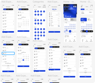
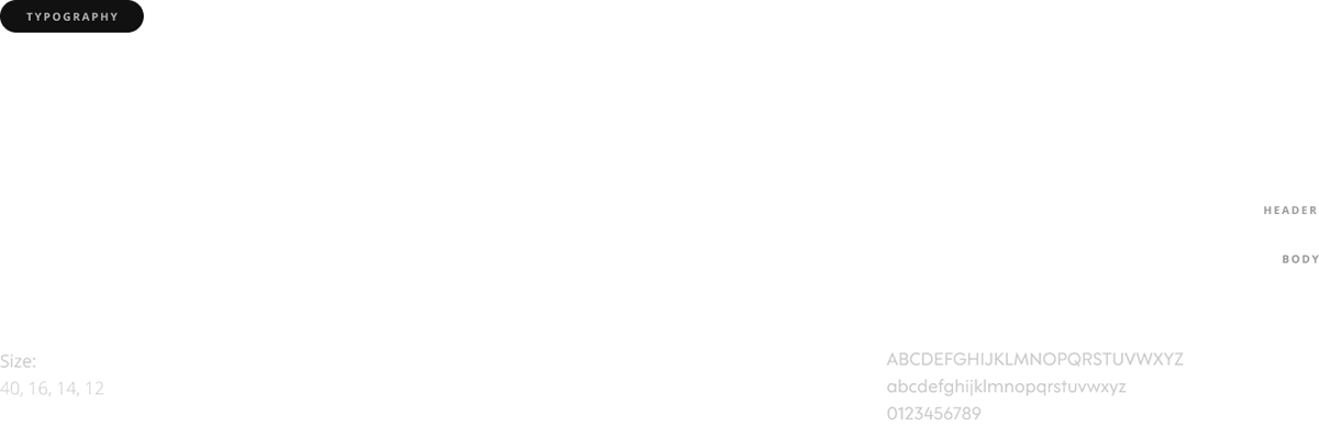
This typeface was chosen for its balance of sharp edges and rounded curves, conveying a
strong, sophisticated look while remaining approachable and friendly.
strong, sophisticated look while remaining approachable and friendly.
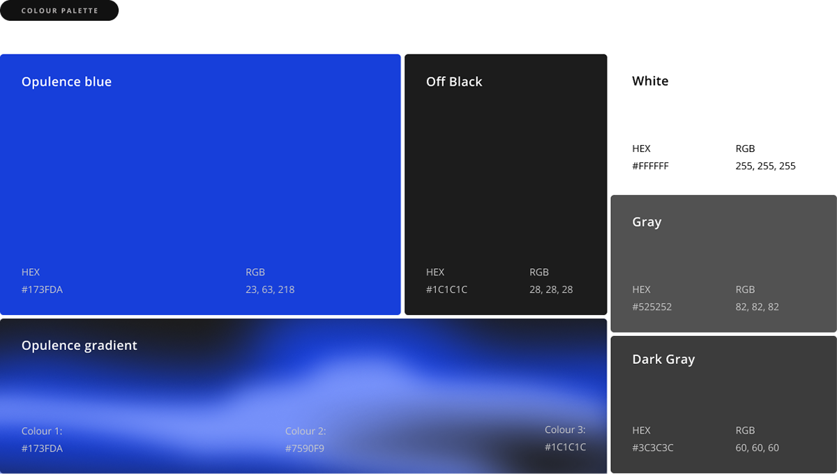
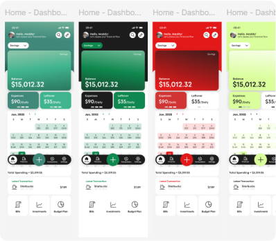
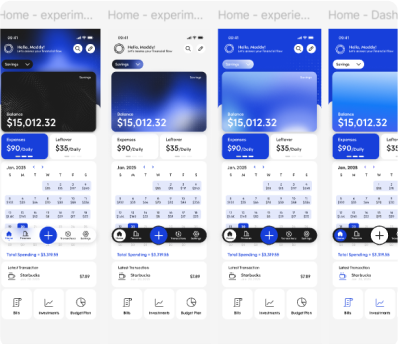
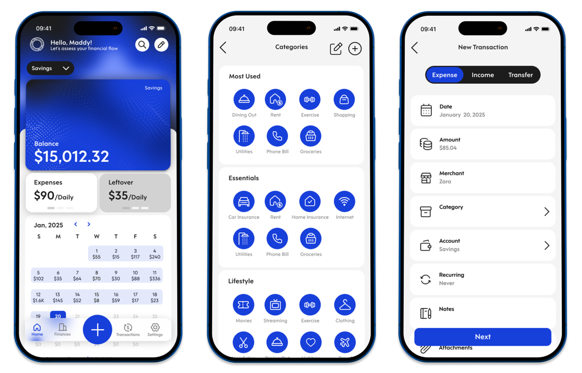
Blue evokes stability and calm, symbolizing trust and responsibility. The gradient reflects the natural ebb and flow of finances, while the neutral tones (black, grays, and white) provide balance and support.
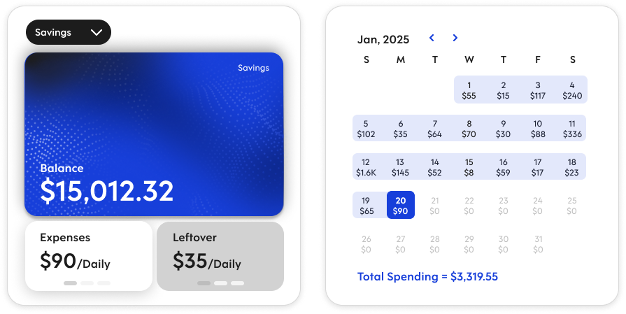
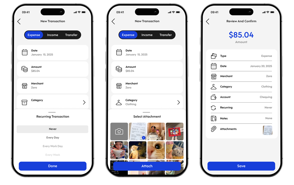
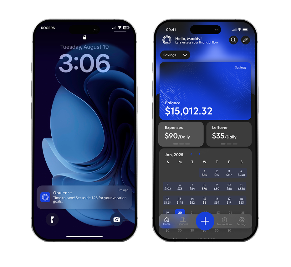


These design solutions address the problems previously mentioned in the beginning of this case study.